
If there is one thing us digital marketers love doing at the beginning of each year is to speculate. Test it yourself and you see what I mean. Just ask 10 digital marketing gurus the same question and I bet you my lunch that you will get 10 different (and interesting) answers. However 2017 is slightly different as there is one answer that keeps coming up in all conversations – mobile. Mobile optimization is going to be more important than ever in 2017.
Those of you who said “mobile”, you were spot on! https://t.co/CtuCW4xV15
— Gary Illyes ᕕ( ᐛ )ᕗ (@methode) December 13, 2016
It’s no surprise that mobile is the “it thing” for this year. I some industries, smartphones are already responsible for 60% of all search queries and in South Africa for every 4 smartphone users, only 1 actually owns a PC. Google has been investing heavily in mobile since “Mobilegeddon” came onto the scene back in April 2015. Then there was the mobile friendly update a in May 2016, followed by the big news of the mobile index in November. Though Google is yet to confirm the launch date for this, I strongly believe that they have already switched over as I have seen m. versions of sites ranking higher than their traditional desktop counterparts. On many instances, I have spotted AMP content on desktop and will get a screenshot and update.
Indeed 2017 is the year of mobile and website owners need to shift from a just being mobile friendly to being mobile-first. Here are 3 tips I believe can help you grow your mobile presence in 2017.
Conduct a mobile friendliness audit
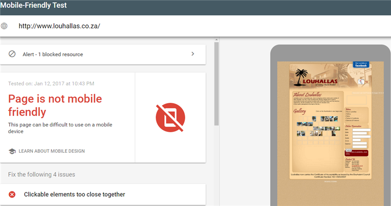
Your website needs to be mobile-friendly before you can even thing of going mobile-first. Take the Mobile-Friendly Test and see how you stake out according to Google’s measurement criteria. Here are the results for my site.

If all is green then that’s great. You are one step closer to winning in a mobile-first world. If you get an unfavourable result such as the one for Louhallas in Edenvale – then you need to go back and sort the issues out.
There are a number of tools that you can use to conduct a full site audit, and whichever one you decide to use, make sure that that it checks all other SEO factors that affect ranking. As a bare minimum keep all resources crawlable so your mobile audit can detect possible problems, such as broken links, missing meta descriptions, thin content, redirect chains, etc. Here are some of the common errors that will take your site nowhere in a mobile-first world.
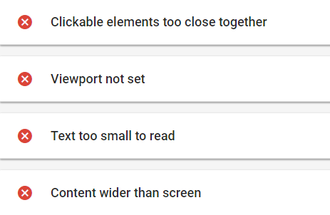
- Clickable elements too close together
- Viewport not set
- Text too small to read
- Content wider than screen
- Slow mobile load times
- Broken or incorrect redirects
- Uncompressed images
- Blocked resources including JavaScript, CSS, and images
- Unsupported or unplayable content
- Intrusive pop-ups and other interstitials
- Mobile-only 404 errors (I hate these)
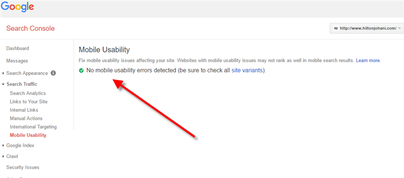
Use Google Search Console to monitor progress as you make corrections on these mobile issues. The Mobile Usability report will guide you identify these as well as provide guidelines to fix them. This is the ideal report you would want. No errors.
Here are the 4 major mobile usability errors:
Focus on Local Search
Google tells us that “businesses near me” searches have increased 2x in the past year. In their Micro Moments guide they also state that 1 in 3 smartphone users purchase from a brand other than the one they intended to because that brand showed up at the moment they searched for more information.
Thus being mobile first means being local-first. You need to win spots on the top results whenever a potential customer searches for the services you offer. You should:
- Register with Google My Business
- Add high-quality photos of your business
- Make sure your NAP (name, address, phone number) is consistent across every website you’re listed on
- Include a detailed schema markup
- Encourage people to leave you reviews
Don’t ignore AMP
Google promotes AMPs (Accelerated Mobile Pages) above regular pages in response to mobile search queries. AMP pages are easy to identify as they have a small lightning bolt next to the result. Have a look at my AMP content on Google
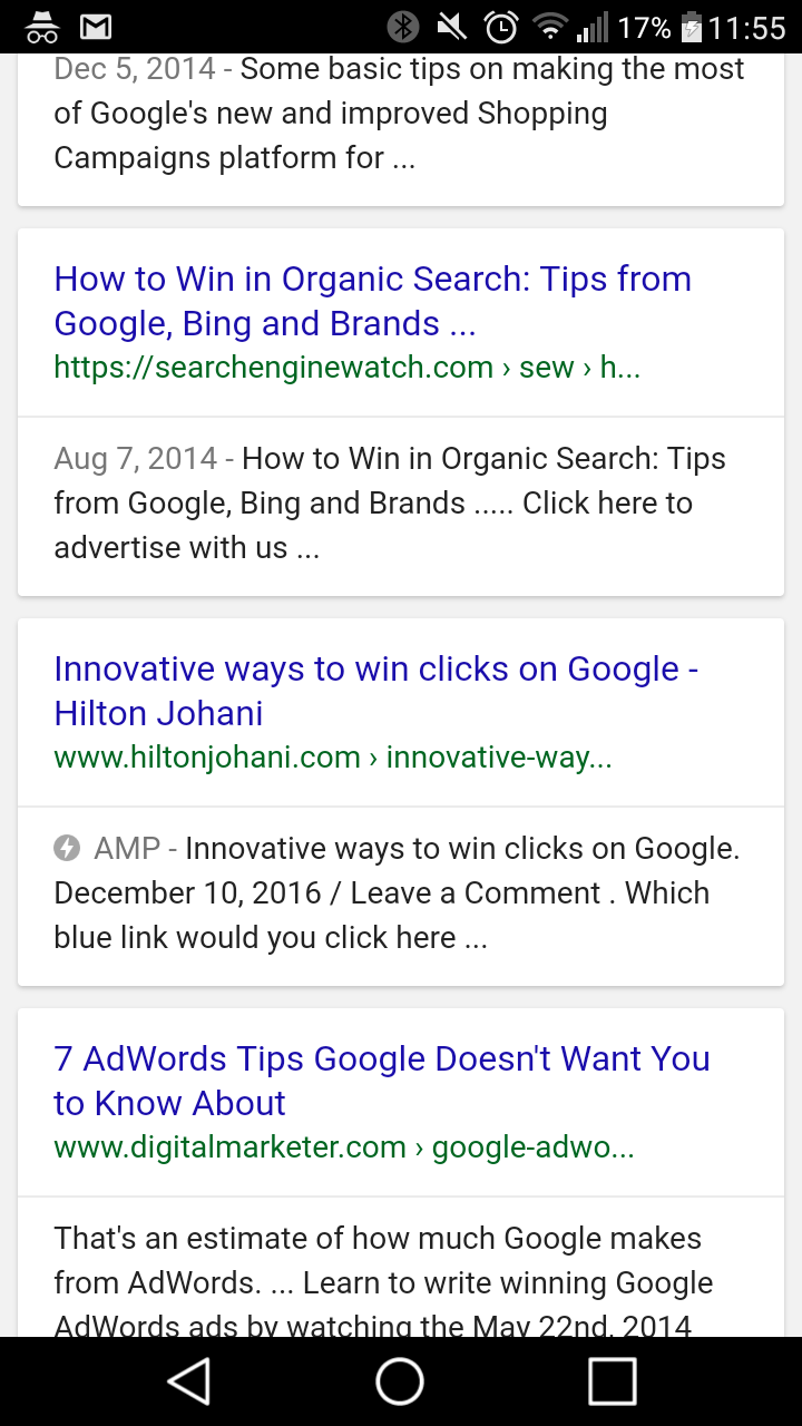
These pages are designed to load almost instantaneously. According to Google, they load 4x faster than a regular mobile page. That’s a huge difference in digital. Basically AMP pages are stripped down pages, coded in HTML and have custom tags to help achieve this lightning-fast load time. If you are not AMP ready then you are missing out on a great opportunity to win traffic. The sooner you get in the better.