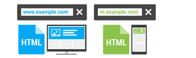
2017 is truly the year for mobile – and please hear me out before protesting as I know this is not the first time you are hearing “the year of mobile” slogan. You most likely heard this numerous times in 2015/16 at a digital marketing conference, webinar or read it somewhere on some blog. However, I believe that this year is truly where mobile is going to make the biggest impact, especially for most of us who depend on Google Organic as the primary source of traffic for sites we manage. As of November last year, Google’s index shifted towards ‘mobile-first,’ making mobile pages the default pages for ranking purposes.
Traditionally Google has always used the desktop version of a page as the default for ranking purposes – for both desktop and mobile search rankings. Google wasn’t happy with this scenario as most times a mobile user would get a completely different outcome when they clicked a URL that ranked higher on mobile because of desktop on-page SEO factors. For example a site would have an awful user experience on mobile, less rich content or even something completely different from the desktop site – and yet be presented to the user by Google as the best answer to a query.
Here is an example of a mobile URL containing much less content than its desktop counterpart
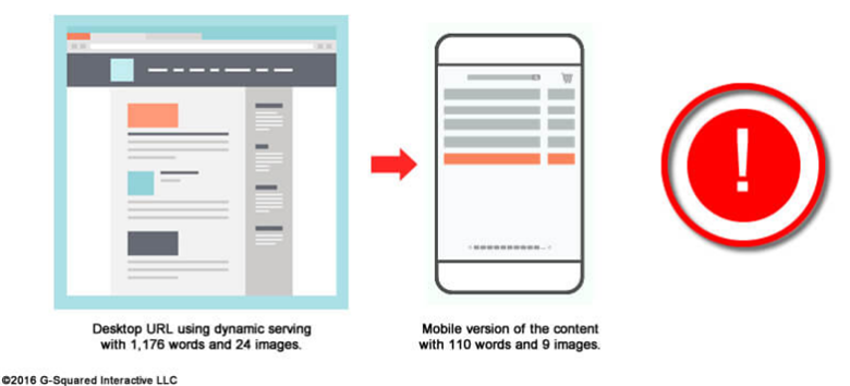
As you can see Google would have failed the searcher if it allows this to carry on. The mobile-first index was created to solve such a problem. When it’s completely rolled out, Google will start to index the mobile page as the primary URL and use that for rankings – for both mobile and desktop rankings. This is a big game changer which requires us to do all things we have done to rank in the traditional desktop index to win in the new mobile index. Mobile URLs will be used to understand structured data which Google said can improve the chances of a site getting into the coveted “a top stories carousel”, or win a rich result feature such as headline text (or better yet larger-than-thumbnail image on the SERP).
The Mobile-first index will use the mobile URL for ranking purposes
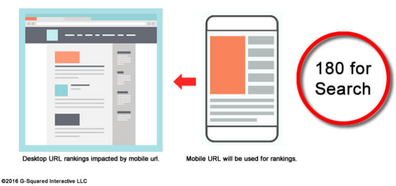
There is no need to panic if you are have a responsive site as from a technical perspective the same content will be presented on desktop and mobile. It’s the screen size that determines how the content is viewed. The problem is where you are using separate mobile URLs, or presenting different content on your mobile URLs via dynamic serving. To win in this new mobile-first index, make sure your mobile pages have the same content as your desktop pages. If not, Google will index the mobile pages and then use the sub-optimal pages for rankings. Which would be a disaster?
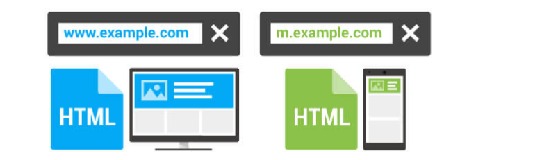
This can possibly cause substantial problems, such as a drop in rankings across URLs on both mobile and desktop. Mind how you use dynamic serving, which provides different URLs based on the user-agent. After the roll out, Google will use the mobile URL for ranking so if there is less content via dynamic serving, then the impact would be catastrophic.