People are visual creatures by nature, and this presents both opportunities and threats for marketers. Most websites that I have seen either have too many objects vying for visitor attention, or do not have an obvious CTA to help site visitors take the desired action. Having too many objects competing for attention makes it difficult for users to prioritise important parts on your web page and as a result will negatively impact conversions.
As marketers we need to control how our pages are scanned by our visitors by prioritising important parts so that visual attention goes where it’s supposed to go. As marketers we need to consider using the following:
- Visual Space
- Irregular Shapes
- Motion
- Faces
- Contrast
1. Visual Space
The amount of space that you dedicate to an object will determine whether it gets noticed or ignored by your visitors. You need to consider use of negative space, borders and size for a particular object. Bigger Fonts and clutter free areas are easily noticed by site visitors. Negative space can be used intelligently to draw attention to headlines and call-to-actions (CTA). CTA have a much better chance of popping out if they are larger than other content areas on the site.
2. Irregular Shapes
Visitors to your website are more likely to notice irregular shapes before regular (ordinary ones). Amazon used this technique with their shopping buttons which were not normally rectangles but has rounded edges.
3. Motion
The human brain is wired to notice motion as anything that moves within our visual field needs to be cleared to determine if it’s not a threat. Motion needs to either be used sparingly or avoided altogether as it causes unnecessary distractions. Use motion only if it supports conversions or if it’s to demo product usage. Also remember this golden law:
In the presence of graphics text won’t get read, and in the presence of motion graphics won’t be looked at. Tim Ash
Have a look at this website that I found after clicking a PPC ad on Google. Note that this is the landing page I arrived on after clicking the advert.
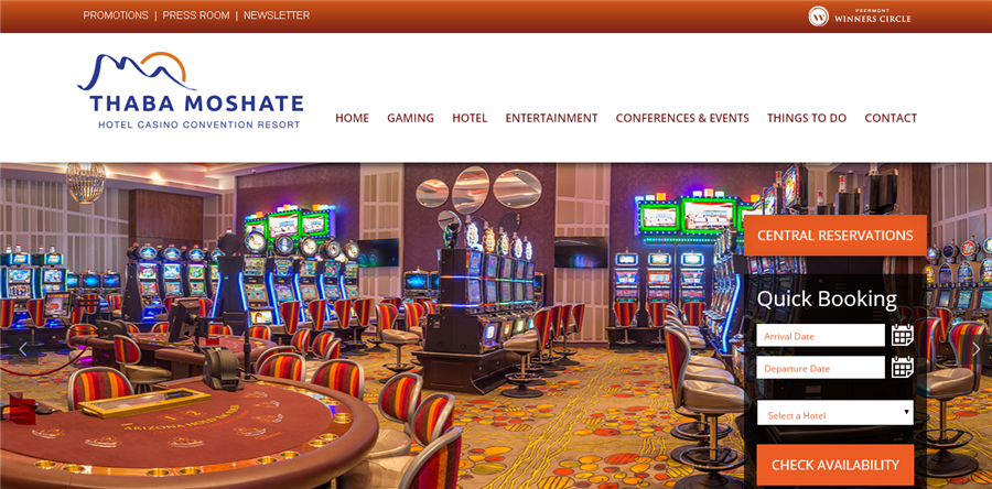
The “Quick Booking” form on the right doesn’t stand a chance against that huge rotating banner advert – worse with all the colourful slot machines. Get rid of these types of banners – They draw too much attention and will draw visitors away from other important navigational parts of your web page. Most of the time banners are completely ignored due to banner blindness
4. Faces
Faces are beautiful and add a personal touch to your sites. However you need to use these wisely because like motion they can draw attention away from key areas of your website. When uses faces you need to consider the direction of the gaze. Photos of people looking past an important part of the page will be taken as a signal of something else interesting and will direct attention away. You want the faces of the people in the photo to look (point) towards your CTA.
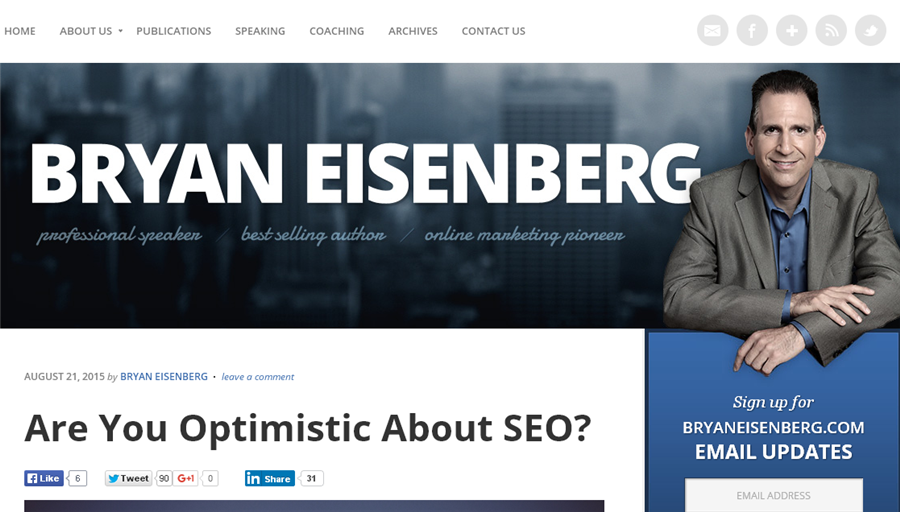
See how Bryan is directly inviting people to sign up for his newsletter by using clever imagery.
5. Contrast
Contrast can be used to direct visual attention to the desired sections of a web page. Using a red button as the CTA will stand out against a grey theme when compared to using a CTA with different shade of grey. Trust is a key driver of conversions and marketers normally like to add logos of companies they have worked with/for. However these logos shouldn’t draw attention from your own logo. Contract can be used to downplay these logos by greying them out. People can still see them and remember them but attention will remain on your logo.
See how Lead Pages greyed out associate logos