When creating lead generation landing pages, do you start by writing a punchy, benefits-driven headline, with tonnes of bullet points emphasizing the benefits of your product or service? If you answered yes then you really need to read this as you are not being effective. When it comes to lead gen pages, starting with your opt-in form can help you generate more leads. Most web designers spend more time thinking about page design (colours, fonts, images), while copywriters spend way to much time on the pages headline and other call to actions. This is all good except that it ignores one key ingredient in any lead gen page – the form. The form unfortunately, usually looks and feels like just an afterthought – something just slapped on the page to help get a potential client’s name, email and phone number.
There is a different conversion methodology called Form-First design, where you remove everything from the landing page and design the form as if its the only thing people will see when they land on your lead generation page. The goal is to design a form that can stand alone, and communicate everything it needs to in order to persuade people to fill it in. The form should be able to work in isolation and communicate its purpose, i.e the what, why, when and how to users without them having to reference other elements on the page such as the headline to figure out what to do. A common problem with most lead gen pages is that the form does not communicate its purpose. It does not explain what the user will get when they fill it in, and does not provide any rationale for why they should do so. Take a look at these examples of forms that cannot work in isolation.
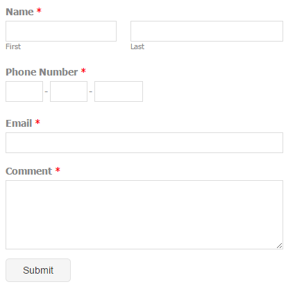
submit for what?
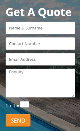
Does clicking on the orange send button submit my answer for marking?
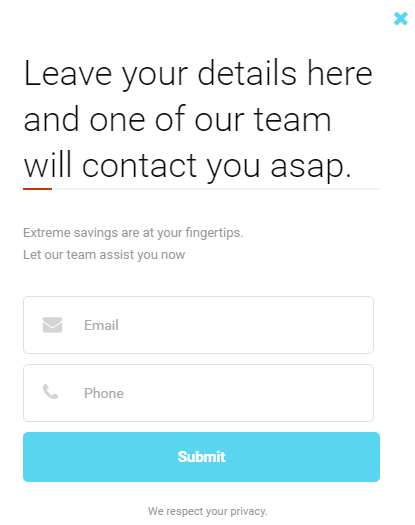
Contact me asap for what by the way?
And I found these in less than 5 minutes. This is the sad reality on most lead gen landing pages. Trust me I have seen over 5,000 of these little rascals in my lifetime. The joys of working in digital marketing.
Now that we have seen the bad now let us look at how your form should be structured to make it as effective as possible in communicating its purpose.
6 elements of a high-converting lead gen form
There are similar to the 6 fundamental elements of a great landing page except that they are limited to the scope of the form. The wireframe below incorporates all the elements.

1. Headline
Use the form headline to introduce the “What” of your offer. The headline should let the user know what they will get if they interact with your form?
2. Subhead
Use this to add a clarifying description of what the offer is. This covers the “Why” I should care about your offer.
3. Benefits Bullets
The benefits extend the “Why” in a format that is easy to read.
4. Form
Now the form can be introduced as its purpose has been introduced.
5. CTA
This describes what will happen when you click, or reinforces what it is you’ll be getting.
6. Closer
A Closer is used to encourage a click. There are different types – social proof, a trust statement, urgency or important details such as “Free” or “No credit card required.” Exclude stop words or phrases such as “…spam…” as this causes friction.
Here is a near perfect form by Direct Axis. Works well with the hero shot (as part of the overall landing page design, which helps communicate the human angle of the business. But it’s still missing the clarity it needs. Furthermore that ID field might turn away people who have not yet memorised the number (like me) or who feel insecure about giving away sensitive information online.

Armed with your new Form-First Design methodology, go back and look at your own forms on your landing pages.